This post is my recording of math activities and a rough plan for the same, with models created by the children. The base being another blog which I've recorded previously. (creative360°: 3 Dimension and Spatial Intelligence)
Objective : To use Spatial Reasoning as a tool to encourage mathematical skill development.
What is Spatial Reasoning?
It is the ability to visualise and understand things in a three dimension.Understanding how different pieces fit together, describing their position and direction, their shapes and sizes, all form part of spatial reasoning.
Workshop 1 (09/01/2021)
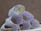
Content : Honeycomb, the most intelligent mathematical architecture in nature. Understanding a hexagon, tiling and why honeybees make hexagonal honey combs.
Students will be able to measure and draw a net of Hexagon. The net will be used to form a hexagon, which will be duplicated to form any number of hexagonal honey comb tiles.


Content : Chandraayan 2, understanding the space mission structure and creating 3D models.
Why Chandrayaan 2 - A milestone in Indian Space Science with fully developed indigenous mission as every design and technology was created by Indian scientists. It was launched on 22 July 2019. Fresh in the memory of children and they coulld easily relate to it.
Workshop 2 (23/01/2021)
Content: Chandrayaan 2, Launcher
Measuring and constructing a Launcher model with cylinders and cones.
Students will be able to draw the net of cylinders (2 different diameters) and cones. They will then attach the same to form a launcher model.


Workshop 3 (06/02/2021)
Content: Chandrayaan 2, Lander
Measuring and constructing a Lander model, understanding Frustum.
Students will be able to draw the net of a Truncated Pyramid/Frustum and create model of 'Vikram Lander'. Well that was like a big step, but hey, they did so well!!!! good job kids....

and more to come.....
Workshop 4 (13/02/2021)
Content: Chandrayaan 2, Lander and Rover
Constructing dome and legs for lander and making rover model.
Students will be finishing the Lander and Rover models by improvising and reusing materials available at home. Get creative guys!!!


 img-1
img-1  img-2
img-2


